Brand guidelines.
Before building this site I put together a brand guideline to follow. This is the first thing I do in any project, to ensure I'm designing components and journeys that are consistent across the whole product.
01. Logo
The space around the logo or icon should be equal to the height of the lower case "n" in "kailani".
The black logo or icon may be used on a white, grey or orange gradient background. The white logo or icon may be only be used on a black background.


Opacity
When used on a white background the black logo or icon can be reduced to 6% opacity for a more subtle effect.
02. Colour
The site will use dark blue, white and shades of orange and light teal to allow for strong contrast between page sections.
The shades of orange and teal can be combined to create an animated gradient background for use on header elements.
03. Typography
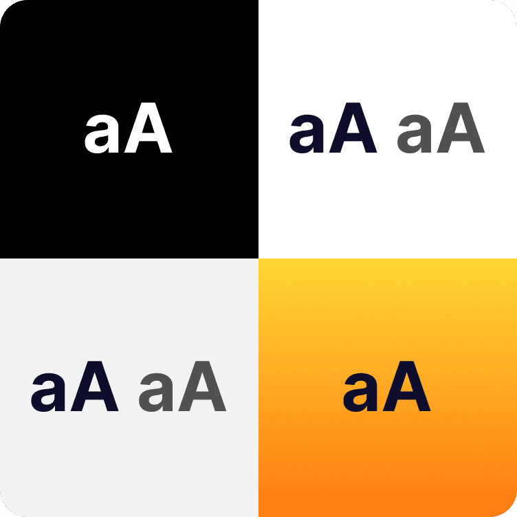
Accessibility is at the forefront of my typography design choices. All text is AAA colour contrast compliant, and meets the Web Content Accessibility Guidelines (WCAG) criteria for sizing.
Throughout the site I have used "Inter", a highly legible and readable typeface from Google Fonts, which was designed specifically for computer screens.
Inter
Hierarchy
04. Layout
I like to maintain flexibility in my patterns to serve the content rather than be too restrictive and end up with content that feels out of place.
The foundations of the pattern are consistent padding, spacing between elements and element styling. Together these create a consistent look and feel across the site, whilst giving me the freedom to experiment.


