Case study
Case study
Case study
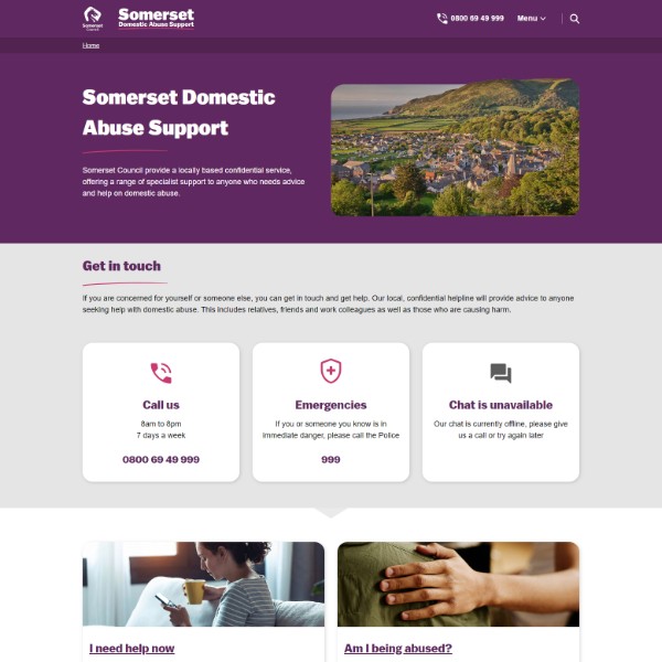
Somerset domestic abuse website.
Somerset domestic abuse website.
Overview.
The objective of this project was to rebuild the Somerset Domestic Abuse website, establishing a more accessible, inclusive and supportive digital resource for people experiencing domestic abuse.
The objective of this project was to rebuild the Somerset Domestic Abuse website, establishing a more accessible, inclusive and supportive digital resource for people experiencing domestic abuse.
Challenge.
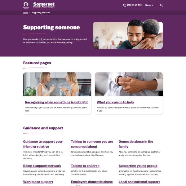
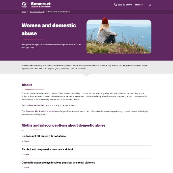
The main challenge in this project was to ensure that diverse audience groups feel seen and supported without inadvertently triggering others through their presence.
The main challenge in this project was to ensure that diverse audience groups feel seen and supported without inadvertently triggering others through their presence.
My Role.
UX/UI Designer
Front-End Developer
UX/UI Designer
Front-End Developer
The team.
Product Owner
UX Researcher
Content Designer
Senior Developer
Product Owner
UX Researcher
Content Designer
Senior Developer
Timeline.
Research and discovery: 12 weeks
Design and build: 6 weeks
Research and discovery: 12 weeks
Design and build: 6 weeks
Tools.
Miro
Adobe XD
VS Code
Wordpress
Miro
Adobe XD
VS Code
Wordpress
User research.
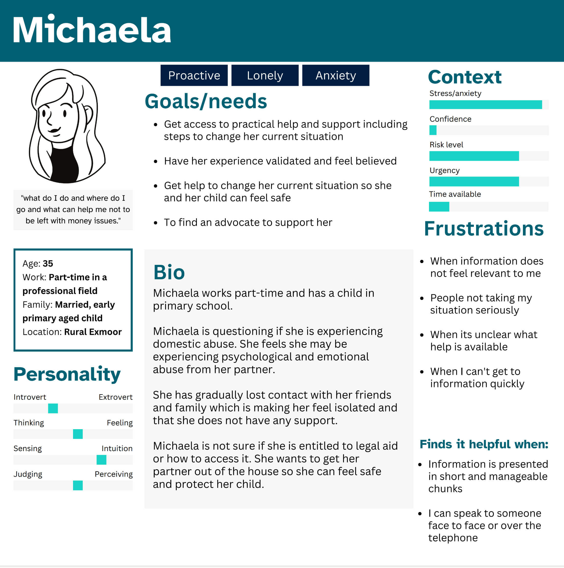
Our User Researcher conducted interviews and extensive research on the subject of domestic abuse. She established 10 personas to represent the diversity of people who experience abuse, and the professionals who work with them.
We sorted the user feedback into themes, and to consider "how might we" statements. From these themes we were able to begin ideating about key features and the layout.
The key outcomes of the research were the need for a quick exit mechanism, clear contact details, simple navigation and easy to read information.
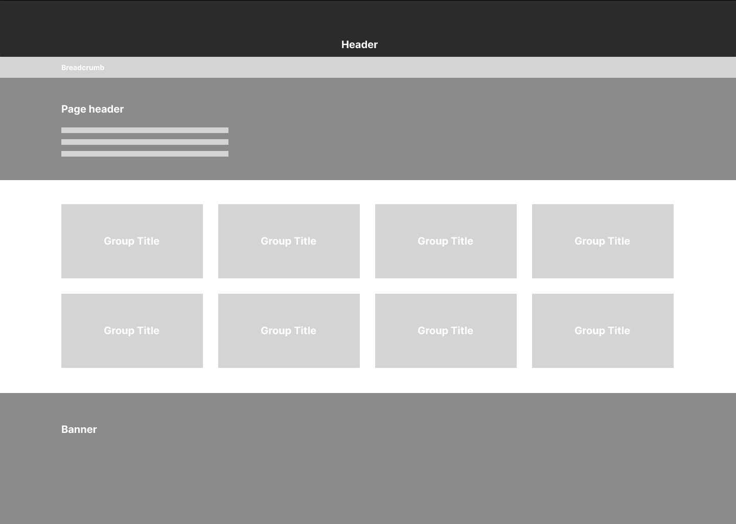
The research had validated that the existing architecture was making information difficult to find, so I advocated for us to reconsider how we organised pages into groups.


Concept creation.
My go-to first steps when designing for a new sub-brand are always to check the brand colours are colour contrast compliant, and to set up the typography rules. I imported the Somerset Design system component library and adapted it to suit the needs of the project.
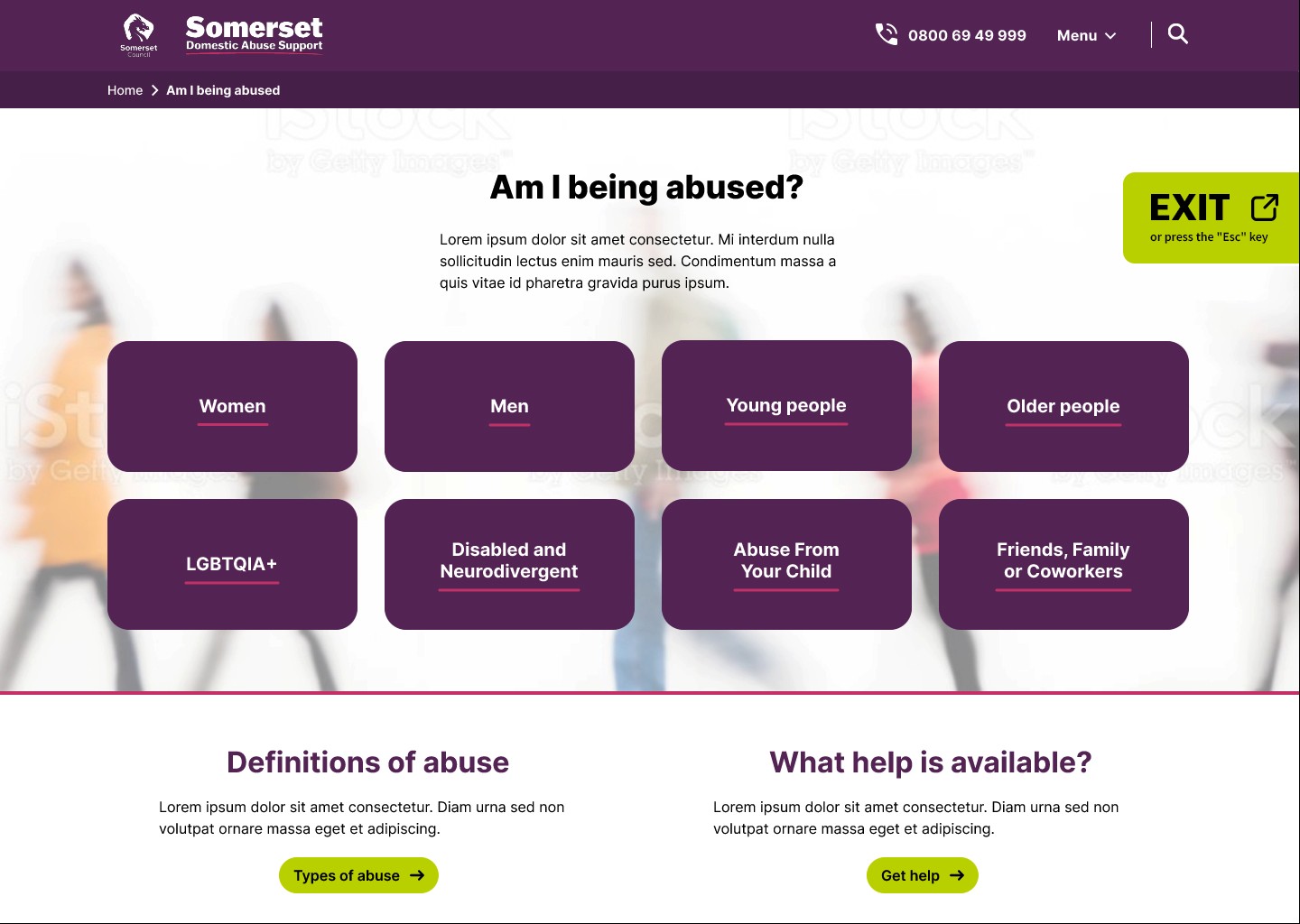
The design system we've built at Somerset Council is flexible, and doesn't feel restrictive when applying the templates to new products. For this website the user research validated that it needed to visually feel safe and welcoming, so I softened the curves, and focused on positive imagery.
Any custom components, such as the exit button were wire-framed and prototyped, before being created as custom layouts in our WordPress theme.
Key features.


Quick exit
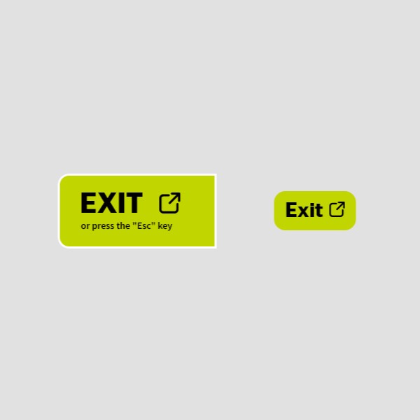
I collaborated with our developer to ensure that not only does it load a different website on a new tab, but it also hides our website on the original tab.
We have since iterated an improvement to further simplify the wording, considering user feedback.
I collaborated with our developer to ensure that not only does it load a different website on a new tab, but it also hides our website on the original tab.
We have since iterated an improvement to further simplify the wording, considering user feedback.


Contact us
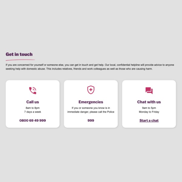
I organised the contact options into distinct choices to minimise cognitive load for the user.
The option 'Chat with us' dynamically changes to 'Chat unavailable' outside of business hours, ensuring users easily understand when the chat feature is not available.
I organised the contact options into distinct choices to minimise cognitive load for the user.
The option 'Chat with us' dynamically changes to 'Chat unavailable' outside of business hours, ensuring users easily understand when the chat feature is not available.


Sticky footer
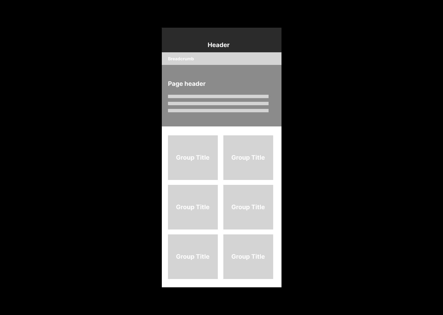
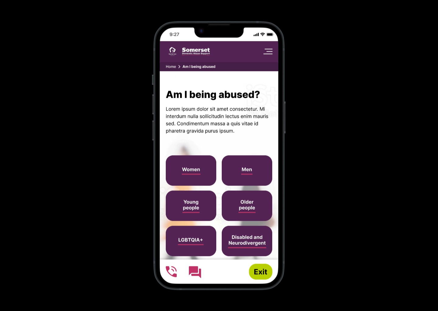
For mobile devices, I designed a sticky footer housing convenient quick links for calling or chatting with the service, accompanied by the quick exit button, ensuring easy accessibility of that feature at all times.
Working with our Senior Developer, we considered WCAG 2.2 compliance in the development of this feature.
Immersive experience.
When thinking about to how to help the different audience groups to feel seen by the content, I devised an interactive section to provide an immersive experience.
A simple grid of blocks serves as the mechanism for users to click and expand specific information tailored to their needs, eliminating the remaining blocks for a focused and personalised browsing experience.
This feature will go live in a future iteration of the page; currently the user clicks to a dedicated page from the block grid.
